Illustration of the Last Few Days Report using NYMEX WTI (LO) options
The Last Few Days Report is composed of several "blocks". We will quickly review what they are and how they might be interpreted. The report is composed of a title page plus a collection of plots (three per expiration in the report corresponding to sticky strike, delta or moneyness ). Finally, each report is capped with some notes.
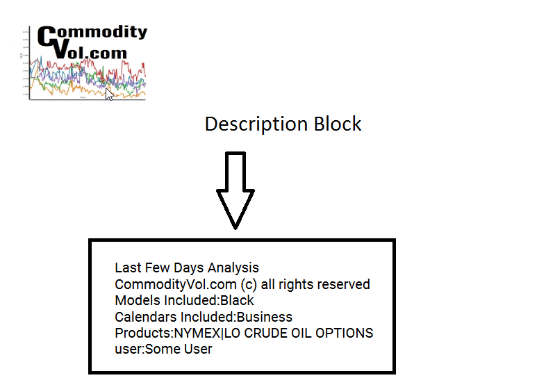
The Title Page
The title page has very basic description presented. It lays out the products which were used in the creation of the report. The user is specified. Additionally, details about model and calendar choices are also spelled out.
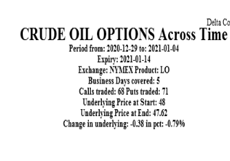
Top Block Sticky Strike
The top block of all three plots (per expiry) contains information that identifies the particular expiry, the number of days in the analysis, the exchange, the product and the performance of the underlying.
In this case, we see that this product trades on the NYMEX, covers the period 12/29 to 1/4 during which time 68 call strikes traded and 71 put strikes traded. The underlying price fell by almost 0.8%.
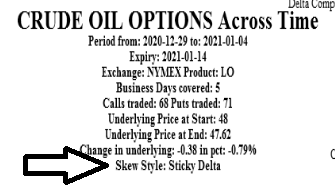
Top Block - Sticky Δ
The information is the same as the item above with the exception of the note of the sticky Δ.
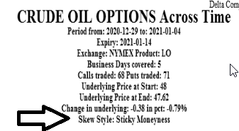
Top Block - Sticky moneyness;
The information is the same as the item above with the exception of the note of the sticky moneyness.
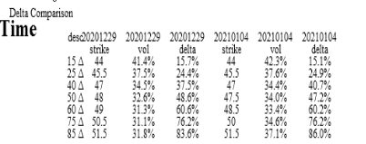
Δ, Strike and Vol Block;
The information summarizes the vol by stylized delta. It maps the stylized Δ to the closest actual strike, and gives the strike's vol as well as actual Δ. This is done for
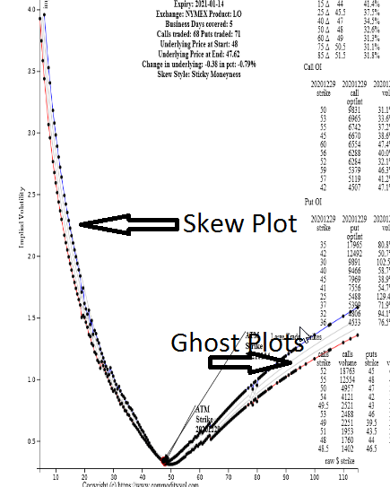
Skew Plot
This section plots the starting curve and ending implied volatility curves. The strikeson the beginning and ending curves are denoted using filled in circles. The starting curve is of red color, while the ending is blue. Additionally, the At-the-Money strike is labeled by the arrow and note, for both the starting and ending curves.
Notice that between the dotted curves are smooth thin curves. These "Ghost" curves are the volatility curves corresponding to the intervening days.
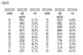
Call Open Interest
This block takes the call open interest and shows the top 10 strikes by open interest as well as the implied volatility at that strike. This is done for the start and end date. Notice that the top strike's position was unchanged. However, past that notice that relative interest in the higher strikes declines over this time period.
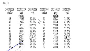
Put Open Interest
This block takes the put open interest and shows the top 10 strikes by open interest as well as the implied volatility at that strike. This is done for the start and end date. Notice that not much changed on the put side, with the exception of volatility comming off.
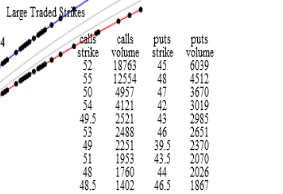
Actively Traded Strikes
This block lists the strikes which exhibited the most traded volume. Again, the pace of trade and strikes trades can sometimes inform the observer where the market's interest lays.